


Would you like to add a slide panel menu to your WordPress site?
Adding a responsive menu will make it easier for users to navigate your website when using mobile devices. When they tap your menu icon, a panel menu will slide onto the screen using a beautiful animation.
In this article, we’ll show you how to add a slide panel menu in WordPress themes without writing any code.

Why Add a Slide Panel Menu in WordPress Themes?
Well-designed menus help your visitors find their way around your WordPress website. Many of your visitors will be using mobile devices, so it’s important to preview the mobile version of your WordPress site to see how your navigation menu looks on smaller screens.
Luckily, many WordPress themes come with built-in styles that will automatically show mobile-friendly menus when viewed on a small screen.
However, you may want to customize your mobile navigation even more and add a fullscreen responsive menu or animated slide panel menu.
With that in mind, let’s take a look at how to add a slide panel menu in WordPress themes.
How to Add a Slide Panel Menu in WordPress Themes
The first thing you need to do is install and activate the Responsive Menu plugin. For more details, see our step-by-step guide on how to install a WordPress plugin.
There is a premium version of Responsive Menu with extra themes and additional features such as conditional logic, but for this tutorial, we’ll use the free plugin.
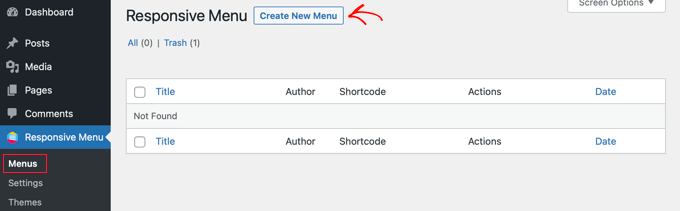
Upon activation, navigate to the Responsive Menu » Menus page. Once there, you should click the ‘Create New Menu’ button at the top of the screen.
You will then see four themes that you can use for your new responsive menu. Additional themes are available for purchase.
For this tutorial, we’ll use the automatically selected theme. You can then click the ‘Next’ button.

This will take you to the Menu Settings page. Here you can enter a name for your responsive menu, and then select which WordPress menu you’d like to be displayed in the panel.
For the sake of this tutorial, we chose the ‘Navigation’ menu. If you need to create a new menu, then you can learn how by following our guide on how to add a navigation menu in WordPress.
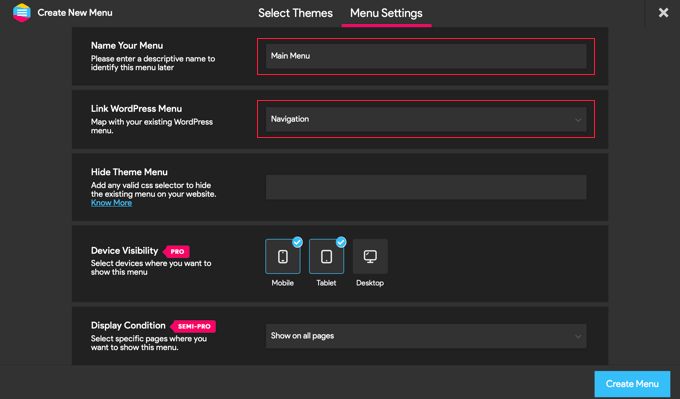
You can also hide the normal menu that comes with your WordPress theme so that your users will only see the new slide panel menu. You do this by entering CSS code into the ‘Hide Theme Menu’ field.
The code you need to enter here varies from theme to theme, and you can learn more details by clicking the ‘Know More’ link.
Users with the Pro version have a few additional settings. For example, Pro users can select the devices and pages where the menu should be shown.
Once you’re happy with the settings, you should click the ‘Create Menu’ button at the bottom of the page. This will take you to a page where you can finish customizing your menu.
You will see a preview of your website on the right of the screen, and there are buttons at the bottom to switch between phone, tablet, and desktop view. You’ll also find customization options on the left.
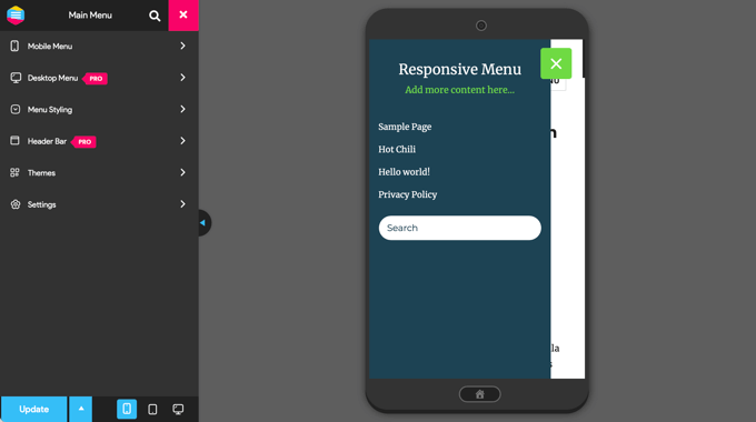
Notice that there is some text displayed above the menu. This is the menu’s title text and a line of text that the plugin calls ‘additional content’.
You can edit or hide the text by clicking on ‘Mobile Menu’ and then ‘Container’ in the menu on the left of the page.
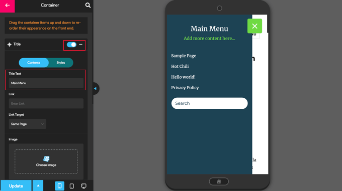
You can type anything you like into the ‘Title Text’ field, such as ‘Main Menu’ or ‘Navigation.’ If you don’t want to display a title, then simply slide the ‘Title’ switch to the off position.
After that, you need to scroll down to the ‘Additional Content’ setting. You can toggle this setting off or type alternate content. In the screenshot below, you’ll notice that the switch has been toggled off so the words ‘Add more content here…’ are now hidden.
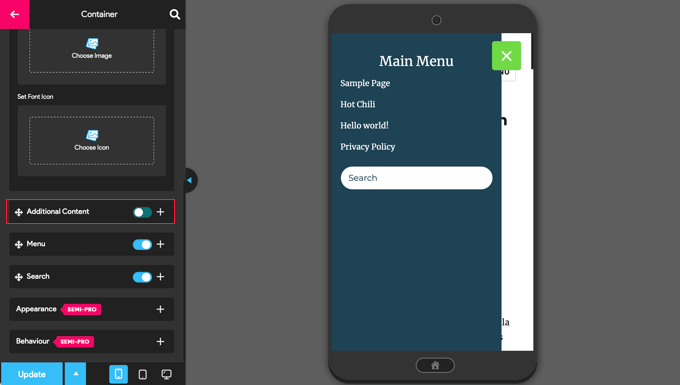
Once you’re happy with the menu settings, make sure you click the ‘Update’ button at the bottom of the page to store your settings.
The Responsive Menu plugin comes with many other options that allow you to change the behavior and appearance of your slide panel menu. You can explore these options on the plugin’s settings page and adjust them as needed.
Now you can visit your website to see the menu in action. Here’s how it looks on our demo website. Note that if the current page is in the menu, then it is highlighted with a color band.

We hope this tutorial helped you learn how to add a slide panel menu in WordPress themes. You may also want to learn how to track visitors to your WordPress site, or check out our list of must-have plugins to grow your site.
If you liked this article, then please subscribe to our YouTube Channel for WordPress video tutorials. You can also find us on Twitter and Facebook.
The post How to Add a Slide Panel Menu in WordPress Themes first appeared on WPBeginner.